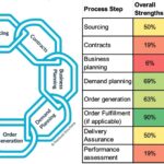
There comes a time in every supply chain team when a spend analysis is useful. It happens much sooner in the supply chain maturity model than most people realize, and it’s an incredibly useful thing. A spend analysis gives you a good view of your top suppliers, their spend, and how that impacts your supply chain risk. But a spend analysis can be expensive, slow, and require specialized software. Today I’m going to walk through, step-by-step, a quick-and-dirty spend analysis. All it requires is Excel and some ability to do Pivot tables, and it can get you insights in less than a day. I also include some thoughts on what to do with your spend analysis once you have it. After all, analysis without action is just a bunch of numbers.
How to: Quick and Dirty Spend Analysis
Note that I am NOT using any AI tools to do this. Are there excellent AI tools out there? Absolutely. I’m not including them here for a few reasons:
1) Most are really not settled or mature yet, and many have lots of bugs.
2)They require an understanding of AI I don’t really have yet personally, and I’m not assuming all my readers do either.
3) The best tools cost something.
The goal here is not the most beautiful spend analysis ever. The goal is a spend analysis that is quick, relatively easy, and requires minimal inputs. If you have the ability and want to add AI to any of these steps to speed them up, go for it and then tell me what you did!
I will also note you can also do this in Google Sheets, but I’m less familiar with that tool and things are often called different names. So this guide is for Excel, but if you’re very familiar with Google Sheets or another similar tool (Apple Numbers, anyone?!), feel free to use that.
1. Pull your spend data. What you’re looking to pull out of your Enterprise Resource Planning system is purchase order (PO) lines. Pulling purchase orders is far less useful in spend analysis because it limits the data you can analyze to just the PO-level data. If you have a PO with 100 lines on it, with PO-level data you’re just getting the spend for the whole PO and you cannot analyze spend by part number. If you can choose the fields you pull, make sure you include the PO number, PO issue date, supplier name, item description, quantity, and price per item. If it’s available, you can also include PO receipt date, item number, category, and quantity received. Export or copy and paste this data into Excel for a year’s worth of data. If there are too many lines, pull the data for six months or even a quarter until the data doesn’t overflow. Chances are good if you are doing this “quick and dirty method,” you don’t have too much data to run a year at once.
2. Edit your data.Now that you’ve created an Excel file with your PO line data, copy your data into a new tab, and name it something like “Edited data.” Name your original tab something like “Raw data.” This is so you can play with your data without having to go through the work of re-exporting it again, and so you have some untouched data to reference. From here on, don’t touch that “Raw data” tab.
Start by creating a column and calculating the quantity ordered times the price per item. This is the total line valueand is what you will use for most of your analysis. Then I like to sort the total line value by spend and look for data outliers. Do you have a huge line somewhere that is clearly a typo or where someone misplaced a decimal point? Also look for data you do not want to include in your analysis for whatever reason. I had a client once who had a major roof repair that is only needed every 30 years and was really throwing off their data, so we didn’t include it. Be very careful if cutting out data, but the “Edited Data” tab is where you can correct or remove information.
In editing your data, this is also your opportunity to clean anything else up you know needs cleaning. Perhaps you have a category “capital” that you use for everything, but you know all the expenses from a certain supplier are for your “factory expansion” project. You don’t want to remove that data, but you want to be able to categorize it that way so you can manually change the category for that spend to the right one. Conversely, you may know that you have 300 categories but they’re all things like “Steel – brackets – left-hand brackets” and you want to cut that down to just “Steel – brackets” to get a little less granularity and find trends. The edited data tab is where you can do all of that.
3. Run Pivot Tables. I like to start with a pivot table of supplier name and a sum of total line value. Note you will likely have to re-sort your pivot table as Descending by Sum of Total Line Value in order for it to be of much use. Screenshot here, but yes, I run a Mac, so yes, it looks a little different than on a Windows machine.

I then like to copy and paste the sorted values (without the total) from my pivot table to a new set of columns. I do this for a couple of reasons – first, pivot tables don’t respond well to additional math, such as multiplying or adding values within them. Yes, I know this functionality should work. In my experience, it simply doesn’t. I’d rather turn things into static values I can manipulate that behave. Second, I intentionally want to lock my analysis in time. If I change (or someone else changes) my Edited Data values, it will change the pivot table. This way the analysis I did isn’t subject to those changes and I have to make a conscious decision to recopy and paste values if I find a mistake, instead of some weird error suddenly causing issues everywhere.
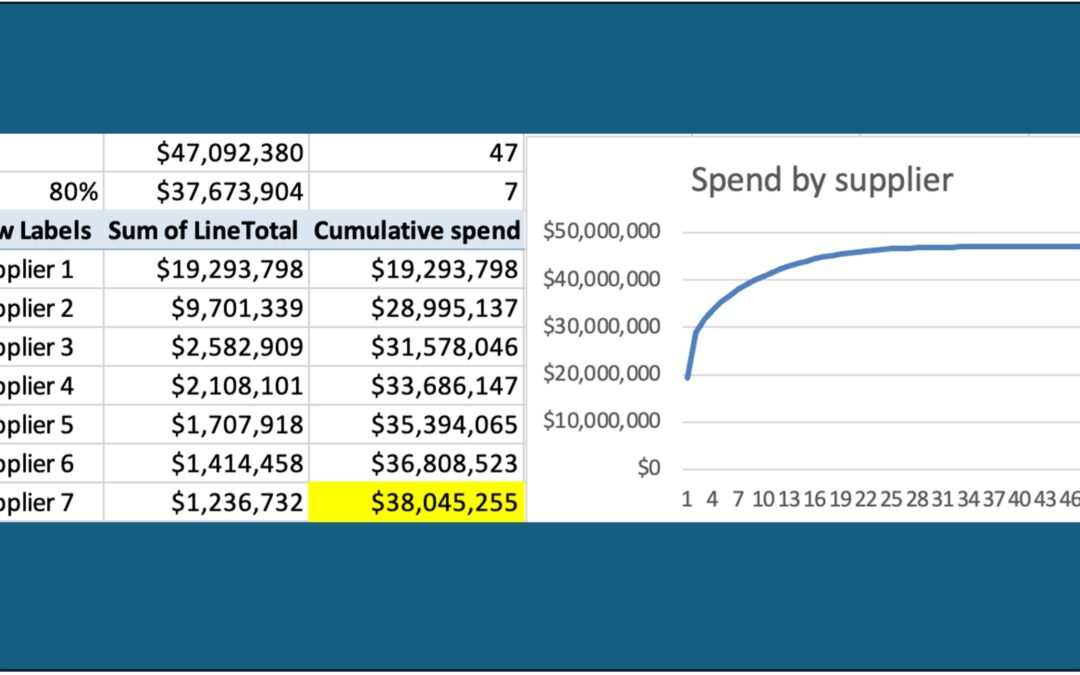
My next step is to create a “cumulative value” calculation. Here’s what that looks like:

The very first line (the largest spend supplier) the formula is simply that your cumulative spend value equals the spend of the first supplier. After that, the formula is that every supplier spend value adds to the cumulative spend total. Note that I have also calculated the sum total of the spend in cell E1 here, and I’ve also calculated the 80% spend in cell E2 (E2=0.8*E1). This tells me how far down my cumulative spend column I will find 80% of my spend. In this example, 80% of my spend is in the top 7 suppliers. I highlight the point where I hit 80% of spend in some color, typically yellow because it’s handy.
Next I use the “count” function to count how many total suppliers I have (in this case 47) and then I count how many suppliers it takes to get down to my yellow-highlighted cell. This and its formulas are shown here:

Why does all of this matter? Because the 80/20 rule (aka the Pareto Principle)always applies. Note that in this case, 80% of the spend is in 14.9% of the suppliers. This means the company is carrying a little more than the “standard” risk in its suppliers and should consider diversifying its top suppliers if possible. In this example, the company actually has 41% of its spend with only one supplier, which means if that one supplier has issues, the company is likely in deep trouble. The supply chain team should probably work to move a bit of the spend from Supplier 1 into maybe some supplier currently in the Supplier 8-12 range if at all possible. Or, it might mean a new supplier should be onboarded to take some of that spend and spread the risk.
4. Repeat Step 3 (Run Pivot Tables) for Part number/description and category (if applicable).Now that you have your spend by supplier, repeat the process for your part numbers (or descriptions if those are more consistent or if you do not have part numbers) and category (if you have spend categories).
Part numbers:
When running the analysis for part numbers, I also like to create columns for the minimum and maximum price paid per part number. The pivot table inputs look like this, and the menu can be accessed by clicking on the “i” next to the field info after selecting the field for your pivot table:

Note you will add your per part price twice to your pivot table, one for min and one for max.
After copying and pasting this pivot table into your sheet, I like to multiply the min and max price paid by the quantity ordered and compare this amount to the actual spend for that part (sum of total line value). What I’m looking for is any part that either 1) fluctuated wildly through the year or 2) jumped in price dramatically at some point during the year. While these price changes are usually justifiable (and justified) in the moment, I can use trends in which suppliers are doing this frequently or which categories are volatile to make decisions about which suppliers to use, which parts to target for contracts, which parts are costing me a lot of administrative time to update, or even which of my products I should push harder through sales because they are less volatile or have seasonal cost trends. I can also use this data to go pursue savings with suppliers who are not tracking to their corresponding category indicesor are raising pricing without good justification.
For analysis of categories, I follow the same basic process for analysis by supplier. But then I use the results to ask a couple questions:
- Are my top categories what I expected them to be? I’m always surprised how often the answer from my clients is “no.”
- Do I have written category strategies for my top three categories? How about my top five or eight?
- How do I feel about how many categories are represented here? Are they the right categories for my business? Do we have too many? Too few? Should we start gradually shifting how we run our categories to make this spend analysis more valuable next time?
5. Go Digging! You’ve done a little of this so far, but this is my personal favorite part. This is also where a true data analyst/data wonkreally shows their value. Using your initial analysis as a framework, go do some looking deeper at any data that looks strange. Do you have a lot of “unlabeled” spend but it’s all in one category or with one particular supplier? Are you paying a whole lot in surcharges or some other “part number” you didn’t realize was so prominent? Do you lack part numbers at all and need to start implementing them? If you filter your “Edited Data” by a certain description (i.e. “Steel”) and run a pivot on that data only, do you find interesting trends or almost-identical descriptions that could be standardized? I never know what I’m going to find when I go digging, but it’s always interesting and valuable. This is also where I end up spending too much time, so consider blocking off only a certain amount of time to go digging to avoid it becoming a time sink.
Now What?
Now you’ve completed a quick-and-dirty spend analysis. The really key piece of all of this is to now do something with it. Here are some prompts to get you started:
- Is your spend too concentrated with a few suppliers? Consider diversifying into new suppliers or spreading your spend further with existing supplier. What about the opposite problem? Consider tightening up your spend and picking a few really good supplier partners to reward with more business.
- Evaluate your tail spend, more thoughts on this one in this article.
- Do you have a bunch of idle or very low-volume part numbers you should obsolete? Similarly, do you have part numbers you can direct your engineers toward for their designs that would end up getting you better leverage with tricky suppliers (i.e. let’s standardize on ⅝” x 2” Grade 8 bolts wherever we can to the point where the stronger Grade 8 becomes less expensive than Grade 5 due to volume).
- Have certain part numbers dramatically increased in volume recently such that you can go back to those suppliers and ask for new quantity price breaks or rebates? Or do you need to adjust your “recommended buying quantity” in your system based on high or low annual volumes?
- Are your categories well-managed? Did their spend surprise you, either high or low? Should you adjust your categories or their strategies based on the analysis?
- Do you need to change processes or provide training to make your data cleaner moving forward? For example, did you find one buyer in particular was skipping the category data entry or frequently assigned the wrong category? Do you wish you had data you previously thought was “optional” and now see value in entering with each PO?
- Did you uncover hidden administrative or approval costs through this process that you can go reduce? This would be from highly variable pricing or cutting multiple POs to the same supplier daily.
- Did you find policy or compliance issues, such as a bunch of POs for $9,999.99 when your policy says your internal customer needs to gather multiple bids for any spend over $10,000? (ask me why I came up with this example…)
Set a time to run a spend analysis again, this time you have a template you can copy and paste into. If you clear and then copy and paste new data into your columns, you can refresh your pivot tables and not have to rebuild them. How often you run a spend analysis is up to your business – quarterly? Monthly? Maybe if you’re implementing a new ERP system it’s even more frequently to find any errors or anomalies early in the process.
If you would like to talk about your spend analysis or even have a quick troubleshooting session, let’s chat. If you’d like to get these articles weekly straight to your inbox and never miss one, sign up for my newsletter.
My book, Transform Procurement: The Value of E-auctions is now available in ebook, paperback and even hardcover format: https://www.amazon.com/dp/B0F79T6F25