A large part of many corporate jobs is presenting data. Typically presented in chart form, data is intended to help others (especially management) make decisions, plan for the future, and understand the current state. This is especially true in a supply chain team, and yet I so often see poorly presented and formatted data or oceans of numbers and color-coding that quickly loses meaning for a reader. Today let’s talk about presenting supply chain data – overall formatting, which chart types tend to go with which data, and how you can make the best choices when presenting your data.
Overall Formatting
The very first question you have to ask when presenting data is: what story am I trying to tell with this data? By the time you are formatting data to present, you should have a pretty good idea of what you think the data means. Is it good? Is it bad? What do you want the reader to do about it? If you see future trends going down, include that projected data in your graphs. If you see available capacity filling up or becoming available, choose a graphic that visually “fills up” or “empties.”
Consider color conventions in formatting your data – in the U.S., blue tends to be neutral, red tends to be bad, yellow tends to be cautious, and green tends to be good. So be cautious about color-coding contrary to the conventions in your own country or business. At the same time, many people who are colorblind are quiet about it and won’t let you know your graphics are hard to read in certain colors. There are multiple tools online to help you choose color palettes that are more accessible to colorblindness, here’s one example.
Don’t put too much on your chart or data. I once had a client hire me to interpret information because the bid tabulation he was receiving from his supply chain leader was a giant spreadsheet with multiple colors and everything calculated down to the penny.
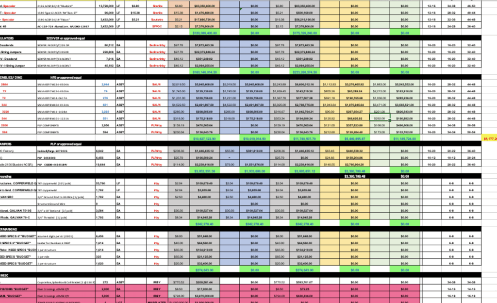
And this is the information that the supply chain leader was sending directly to the executive at the top of operations (no summary!). It’s way too many colors, numbers, and is nowhere near the executive summary it should be. For more on generating executive summaries, see my March 2024 article on the topic.
I’ve personally made the mistake of putting too many lines on a graph many times. Even though the data is familiar to you, it’s not to your audience. Ask yourself if every piece of data on what you are presenting is absolutely necessary to your message. Then see if you can simplify it some more. It should feel too simple to you when you’ve got it right. FIght your “yes, but…” instinct to add in more info.
Follow your company’s style guide, if there is one. Chances are good your corporate communications/public relations team has some sort of guide on what fonts, colors, spacing, and even abbreviations are standard. I worked for a company named MidAmerican Energy, which many of our stakeholders and customers would abbreviate MidAm. Yet the correct abbreviation (which was strictly only to be used within the company) was MEC for MidAmerican Energy Company. It seems like a little thing, but executives are used to reading size 12 Times New Roman font with all tables in Arial size 8 (or whatever yours is). When you give them data that doesn’t match, it feels uncomfortable and they don’t always know why. They will find it hard to focus on the story you’re trying to tell because they’re not in familiar spaces with the formatting (ha! Formatting spaces! Forgive my unintentional pun…).
Here’s an example of a chart with too much data, and which breaks many of the rules I just mentioned. Note that many of these settings are Excel’s default settings (such as setting the y-axis start at zero), so even Excel won’t help you here.
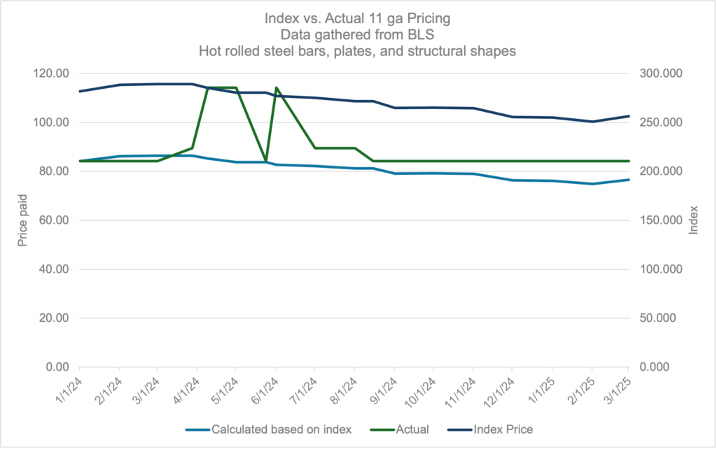
Now compare to this graph, with the same data represented:
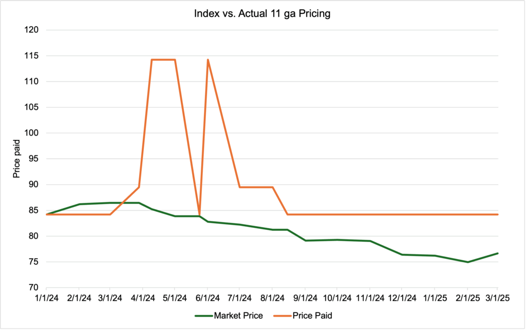
What am I trying to say? If your answer is “We’re paying above market price!” then that’s good because I got my message across. There is probably still more I could do here, but I have to be careful not to add things unless they truly bring clarity. For example, an arrow showing the difference between the current market price and the price paid might highlight further, but it also might be just too busy. What would you do to this chart to make it clearer?
Line Charts and Bar Charts
Line charts and bar charts are some of the most common charts in use. They are generally easy to use, easy to read, and easy to build.
Line charts are used most often for trendlines. Especially in a supply chain, if dates are on your x-axis, you’re probably building a line chart. Bar charts tend to be best for comparing amounts between two or more data sets. I like bar charts when many others would use a pie chart, more on that below. So let’s look at one of the more common supply chain chart topics: spend.
This first chart is spend by supplier as a bar chart. The supplier number, simply as a ranking from most to least spend, is on the x-axis. The spend is on the y-axis. Note in many companies, there would be a strong desire to relabel the y-axis in thousands or even millions of dollars to get rid of so many zeroes.
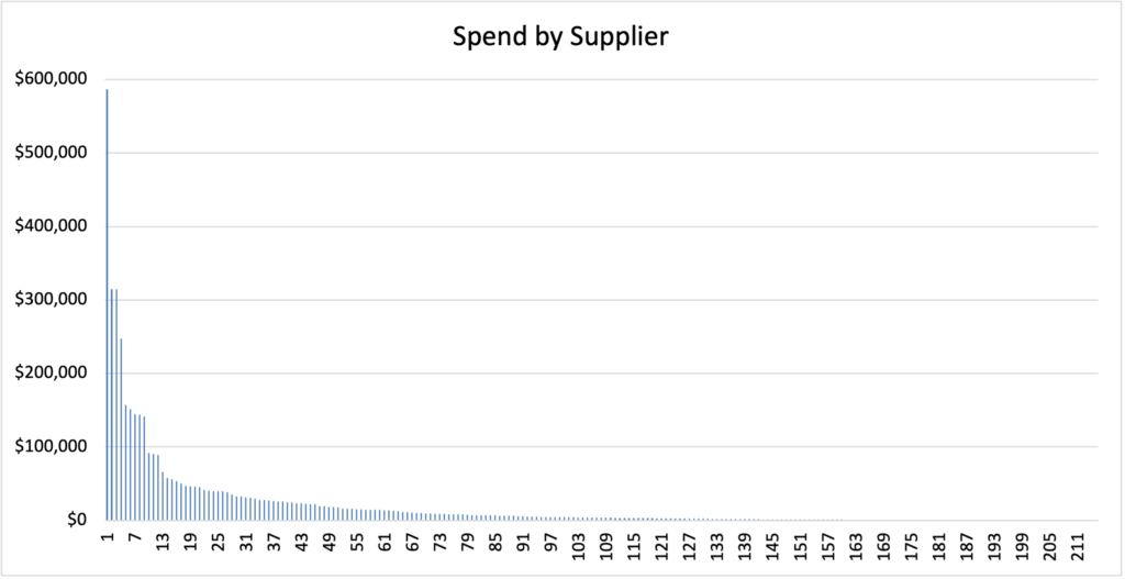
This is a good chart within a supply chain as it’s the kind of data everyone is dealing with. But it’s a poor chart for communicating with executives for a couple reasons. First, unless you’re trying to show that the business is very concentrated in spend with your highest spend supplier (again, what story are you telling?), it’s very hard to read. Second, it’s a very granular picture; it shows individual spend with individual suppliers. It’s showing the trees and not the forest. And third, this chart “feels” like it goes down and to the right. Executives especially are used to “good” things going up and to the right and “bad” things going down and to the right because they spend a lot of time looking at revenue charts. So think about whether your data at a glance appears “bad” or “good”. Here’s that same data as a cumulative line chart, where each supplier’s spend is incrementally added to the previous supplier’s spend:
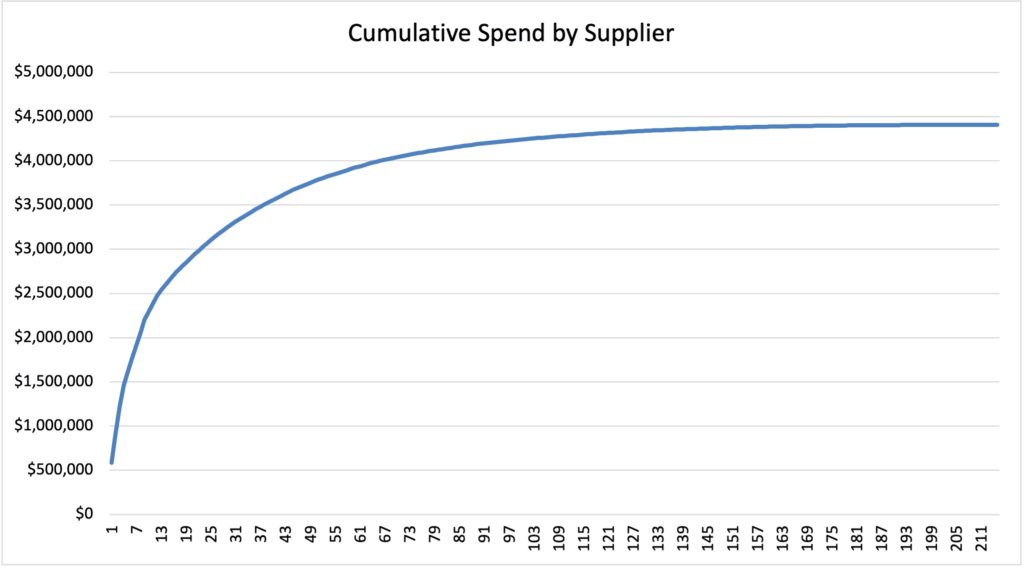
I typically like this one better for a few reasons. First, it’s easy to mark or pinpoint the 80% spend mark on this chart if you are demonstrating the pareto principle. Second, this chart goes up and to the right, which is the “happy” direction for executive communications. And third, this chart tells me at a glance that our overall spend is about $4.5m, which is a big picture number.
Pie Charts
I’m going to level with you. I hate pie charts. I never use them unless forced. The original title of this article was “Why pie charts are evil”, but I decided to expand my topic a bit and find more to say about presenting data in general. So why don’t I like them?
It’s hard to compare data in a pie chart. “But that’s exactly what they’re for!” you say. So let’s look at the following chart showing supplier market share (important if building a category strategy):
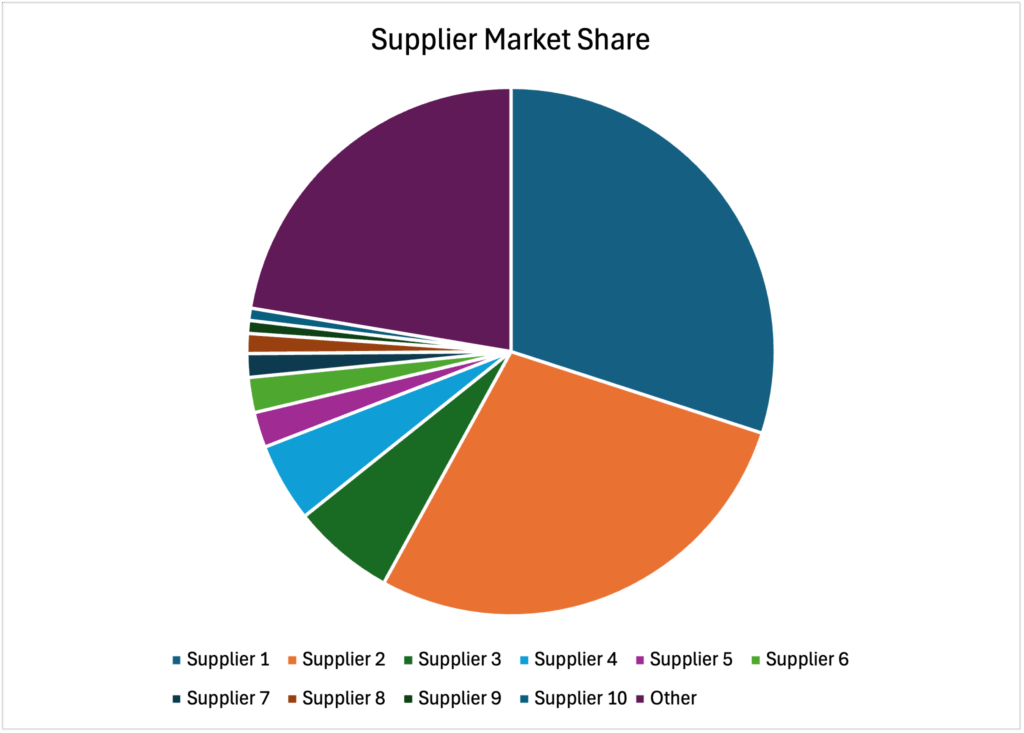
When looking at this chart, can you tell me how much more market share Supplier 2 has than the “Other” category? How about if Supplier 5 and 6 have the same market share or different? Is Supplier 1 or Supplier 2’s market share larger? Because Supplier 2 is using a lighter color, it actually looks larger than Supplier 1, but it’s slightly smaller. Note also that colorblindness is an absolute nightmare here. Many of these colors will look the same to certain colorblind types, but different to others. And if there wasn’t a white line dividing sections? Yikes. The potential solution is to label the sections, but that gets very ugly and hard to read very quickly. Now look at the same data as a bar chart:
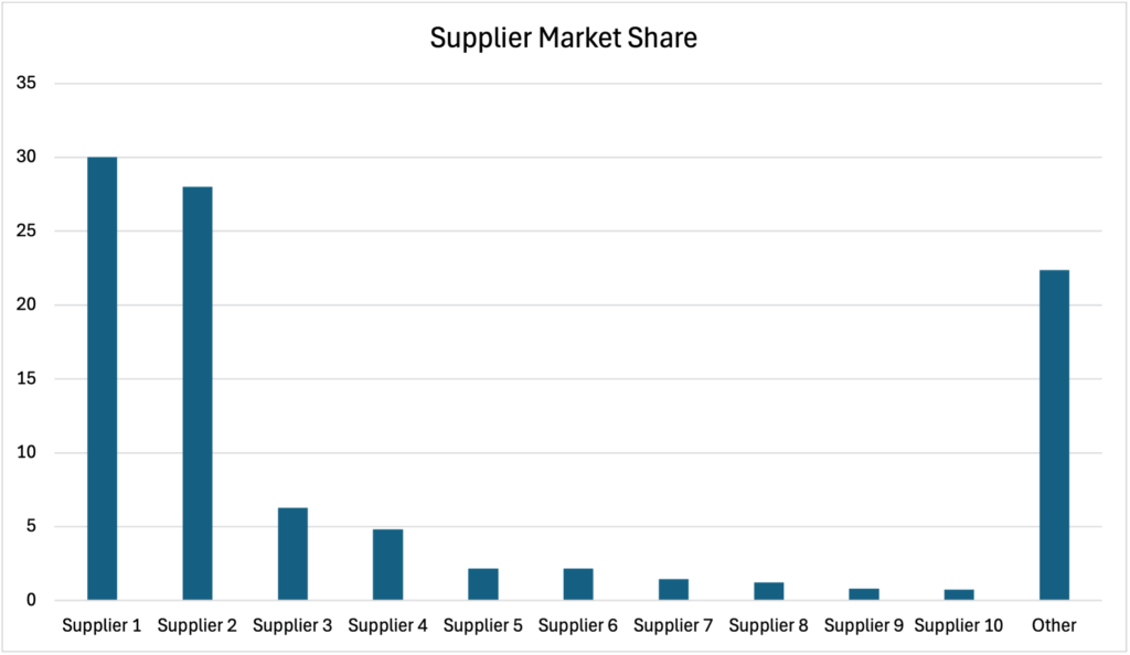
Is this more boring and less colorful? Yes. But isn’t it also simpler to read? We can very quickly compare and estimate some values for these suppliers. It’s also quite obvious that Supplier 1 has more market share than Supplier 2. While we could have guessed that because the convention is to sort pie charts by descending value (putting the “miscellaneous” or “other” at the end), now we can clearly see they are different. It’s also notable that we have three main groups of suppliers in this market:
-
A dominant pair of suppliers with the bulk of the market share
-
A couple of strong secondary suppliers that might offer something niche or have a particularly loyal customer base
-
Everyone else, of which there are a lot
We know we should go figure out what’s different about Supplier 3 and 4 and see if they’re a real contender, and we probably need to focus our relationship efforts on Suppliers 1 and 2.
So while not everyone agrees with me, I think pie charts are evil. Don’t use them unless you’re showing your audience how much of a pie remains after you’ve eaten a piece.
Waterfall Charts
Waterfall charts are interesting and are almost always used to show savings or cost breakdowns. They can be very clear and show where the most opportunity is, but they are also tricky to build and don’t always behave well in software. Here’s an example of a waterfall chart showing the savings after running a bid event on a particular commodity:
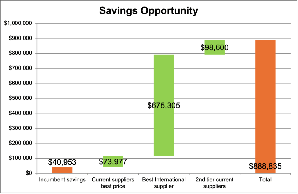
Note how clear it is that the opportunity is in moving business to the best international supplier. I’ve also seen these used in breaking down all the costs to build a machine or a vehicle or other complicated manufacturing component, showing where most of the cost and opportunity are. Again, keep in mind the story you are trying to tell. Waterfall charts are best when one component represents a large portion of the whole.
Bubble Charts
Bubble charts are interesting and also quite specialized. I find them most useful for when I want to represent three pieces of data, with the last one typically being spend. Note these are almost never useful for executive presentations because they badly break the rule of too much data on a chart. They tend to be busy and a bit hard to read if you’re not used to them. One of the most common uses I find for bubble charts is a Kearney chessboard where the x-axis is buyer power, the y-axis is supplier power, and the size of the bubble is spend. This one is also related to a Krajlic matrix.
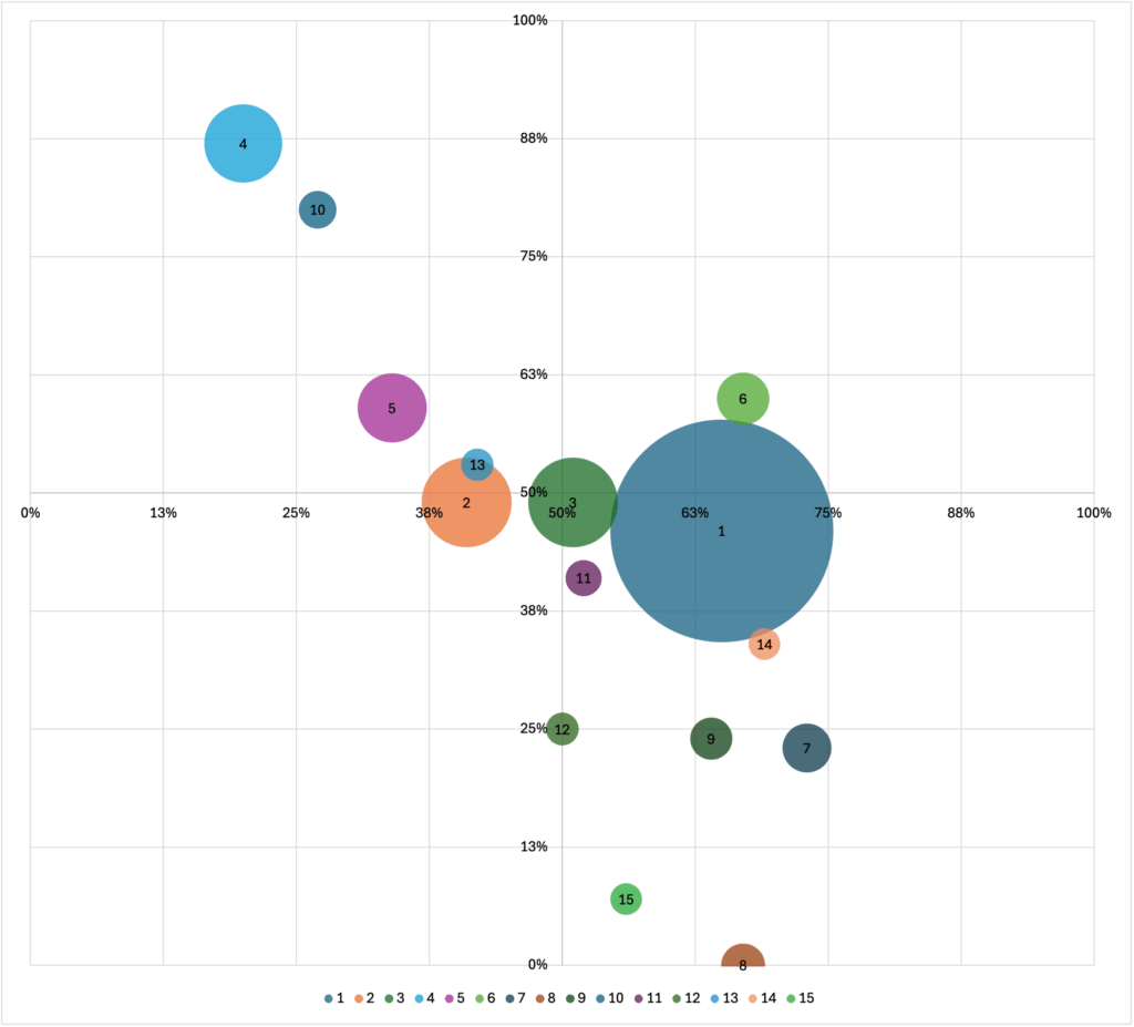
Note this chart is not terribly intuitive and would likely need to be explained. It would be good for an internal team to use to deep dive into all the suppliers in a certain category, or at-a-glance see what kind of bid strategy or negotiation strategy to use with a group of suppliers based on their buyer and supplier power. I have an Excel template I’ve been building for a Kearney chessboard, complete with dropdowns. It’s not quite ready for prime time yet, but if you’ve read this far and would like a copy, drop me an email at janice@passwallsolutions.com with the subject line “Kearney” and I’ll send it to you. You can be a beta tester!
Treemap
A treemap chart is newer to Excel’s toolbox, but is commonly used for category spend. It’s basically a visual representation of how much “space” something takes up as part of a whole. Here’s an example:
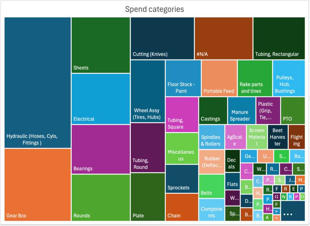
This particular one is fairly balanced, although there might be a few too many categories in this company and some should probably be combined. That is very quick and easy to tell when you glance at their treemap. I also often see where one category completely dominates, like this one:
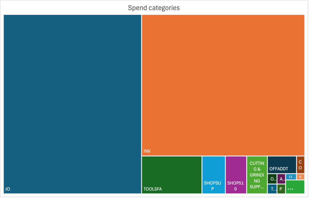
This map makes it obvious that the large Job Order/“JO” category might benefit from being categorized more granularly so the procurement team can focus their efforts on the highest spend categories.
Now that you’ve seen a few examples of supply chain data and how it’s presented, consider how you will present your own metrics. Note that all the data in this article comes from real companies, mostly clients of mine (with the exception of the market share info on the pie chart), although I have obscured identifying data. If you would like to talk about your own data presentations or which chart is right for your information, let’s chat.
If you’d like to get these articles weekly straight to your inbox and never miss one, sign up for my newsletter. https://passwallsolutions.com/newsletter-sign-up/
My book on e-auctions – Transform Procurement: The Value of E-auctions – will be available May 20th! Deep dive into how e-auctions can work in your supply chain and how to implement or expand an e-auction program constructively and sustainably!